
Today on my blog, we welcome Erica Marcum (@ericalligraphy2), a talented lettering artist whom I admire in my Facebook group “Kelly Creates Art & Calligraphy.” Erica always creates really cool effects with my Kelly Creates pens, so I asked her to share a tutorial with you. Enjoy! (Read more about Erica at the end of this tutorial.)
Kelly Creates Supplies: Blank Practice Pad, 3-Pack Black Brush pens, Black Fineliners, Multicolor Bullet Tip pens, Moonlight Markers, Dream Pens Set 2 ‘Meadow’
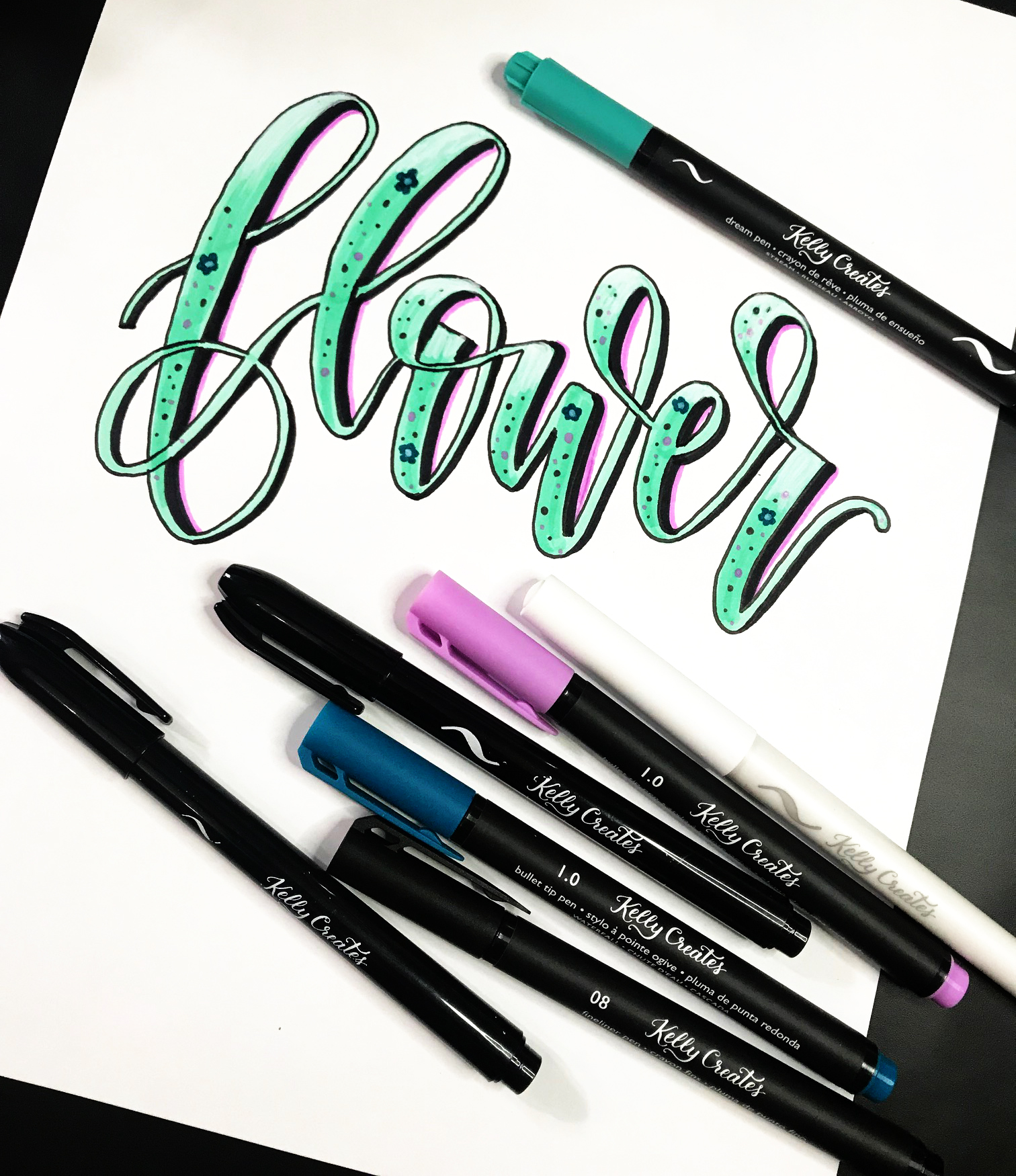
It’s June and my flowers are really starting to pop! Springtime is my favorite because I always have something new happening in my garden. Therefore, I thought the most appropriate word to “illustrate” today is “flower.” And please don’t judge my lack of manicure…I’d rather letter after the kids go to bed than do my nails.
I love brush lettering, but I like to mix up how it looks. Adding details to my brush lettering projects is one of my MOST favorite things to do. It looks harder than it actually is, and little accents can make a BIG difference!
For this example, I started with some standard bouncy lettering using the Kelly Creates Dream Pen “Stream” from Set 2 ‘Meadow’. Sometimes I use guides, but I don’t always…especially if it is bouncy.

At this point, I assess whether I like my thick lines. If not, I will go back an adjust them by adding more of the base color to make a thicker line. Because I want to add detail to this project, thicker lines are needed! Notice you can see darker strokes in the thicks…no worries, we are going to “hide” them. 
You might have noticed earlier, I referred to this process as “illustrating.” Don’t be scared by that word! In a nutshell, it is layering details…and using details to mask mistakes or flaws.
The first layer we are going to add is an outline on the entire word. I usually use the Kelly Creates 05 or 08 Black Fineliners. If it looks a little shaky, don’t worry about it. Keep going! And the more you practice, the easier it gets.

And use the outlining process to clean up some of your lettering lines. I filled this white area with a little base color of the Dream Pen “Stream.”
 Then add some shadows. Many people are intimidated by shadows. My go to strategy: shadow to the right of the thick lines.

And sometimes I put a thinner shadow on the right side of the thin lines. I used the Kelly Creates Large black Brush Pen from the 3-pack here. I like it because it’s a deep, rich black. But you can use any color! For the thinner shadow lines on the upstrokes, I used the Kelly Creates Black Fine Brush tip pen, which is also in the 3-pack and the Deluxe Lettering kit.

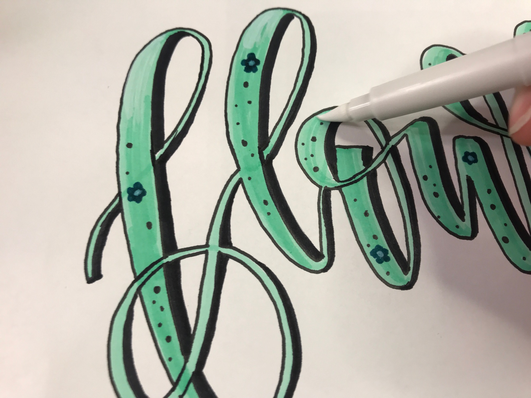
Now time for the little details! I love dots and dot a lot. Black dots. Waterfall dots. Orchid dots. And few little simple blue flowers with a white center are a must too!

I added a little white highlight at the top of each letter with the Kelly Creates Moonlight Marker, a large Brush Pen with white chalk ink. It’s a faux-blending technique I do sometimes. I make quick, sweeping strokes from the top down…kind of like you would dust off your clothes if you got something on them.
And because I wanted one last little pop of color, I added a purple line on the right side of the thick shadow with a Kelly Creates Multicolour Bullet tip pen in ‘Wildflower.’
 All those little imperfections, like strokes in the base color and less than perfect outline, are no longer an issue. Remember that no one is critiquing your lettering like you are….they are admiring its beauty.
Try your hand at adding details and dimension and take it one layer at a time!
Thank you so much Erica for this awesome tutorial…and I just love that expression “take it one layer at a time”. Great advice for designing lettering with patterns and dimension.
For more creative lettering inspiration, follow Erica on Instagram @ericalligraphy2

Erica Marcum is a wife, mother, marketing professional and crafting geek. She has been working in the marketing field for over 17 years and is happy to have this hobby in her bag of tricks. Erica has been brush lettering since February 2018, and practices every chance she gets. Erica’s husband, John, is a huge supporter of her hobbies; thank goodness because he is subjected to looking at daily word/prompts and projects every night. Her two boys, Henry (5) and Hayes (3) keep Erica on her toes and call mommy’s brush lettering her “fancy letters.”
To Shop for the supplies Erica used, click the affiliate shopping links below:


Judy Mathis
June 18, 2019 at 8:58 pm (5 years ago)Great job Erica, you make it look so easy. Gorgeous!!
Erica Marcum
June 19, 2019 at 9:27 am (5 years ago)Thanks, Judy!
Mary Jeane Davis
June 18, 2019 at 9:21 pm (5 years ago)Wow! Looks awesome! I am noting your tips!
Christine Henley
June 18, 2019 at 9:36 pm (5 years ago)I wait to see your words every day! You do make it look easy!!
Lisa
June 19, 2019 at 11:02 am (5 years ago)Another wonderful piece!!
Linda Epstein
June 19, 2019 at 11:37 am (5 years ago)Great tutorial, Erica. I think I really need to not worry about those “shaky” lines of mine and just keep practicing and adding those layers. Thanks for the encouragement.
Leslie Peede
June 19, 2019 at 1:02 pm (5 years ago)Can’t wait to try this! Always love your work
Joan
June 19, 2019 at 2:52 pm (5 years ago)J’ai hâte de prendre le temps d’essayer cela!