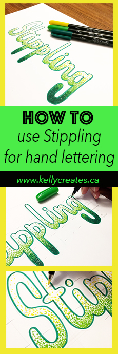
Today on my blog, Design Team member Elizabeth Wise (@wiselettering) is sharing a really cool stippling technique for hand lettering projects.
Stippling is a technique that uses a pattern/series of tiny dots to create the look of shading, based on how close together the dots are (the closer together they are, the darker that area will look from a distance). Usually stippling is used to create shadows, but in this tutorial, I’m going to show you how to use it in your lettering to actually create a blended gradient effect.
SUPPLIES: Kelly Creates Project Pad and Kelly Creates Multicolor Small Brush Pens, pencil, eraser (also in the Deluxe Lettering kit)

When stippling, specifically for blending with colours, I like to use the Kelly Creates Small Brush Pens. For paper, I prefer using the Kelly Creates Project Pad cardstock versus a practice paper because I find the ink is less likely to bleed on the thicker cardstock. Besides those items, you’ll need a pencil and an eraser (also found in the Deluxe Lettering kit).


STEP 1: To begin, draw the outline of any word, in any style of lettering. In this case, I went with a monoline style just for ease of readability. Select 3 different colours to work with, ideally colours that transition well between each other (dark to light etc.). Using the darkest of the 3 colours, trace the outline of your word.
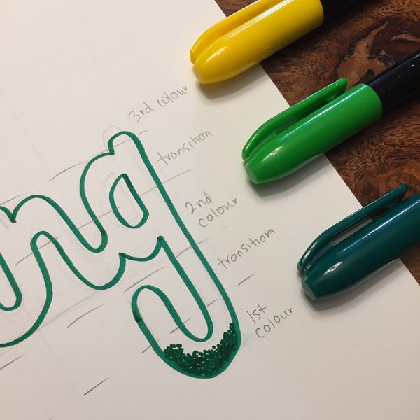

STEP 2: Create guidelines that you can follow to know where the colours will transition in order to keep the blending consistent across the entire word. Starting from the bottom, use the darkest colour and make a series of tiny dots. At the bottom of your word is where the most dots will appear, so don’t be afraid to create almost a solid bunching of dots at this point. Create this pattern up to your first transition line.

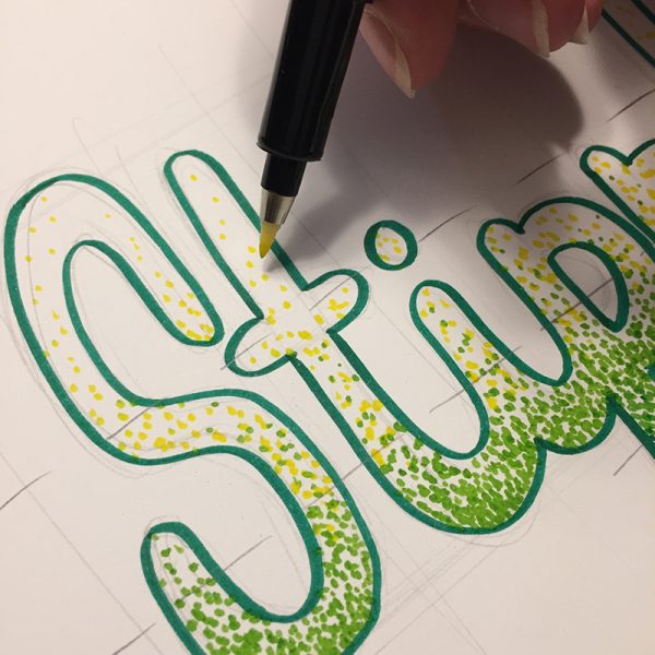
STEP 3: Gradually start spacing the darkest coloured dots out more and more as you move upwards from the bottom of the letter. Now switch to your next lightest colour and start integrating the 1st colour and 2nd colour together through the transition. Continue your 2nd colour with about half as many dots as your darkest colour through the area identified specifically for this colour. Continue to gradually space the dots further apart once again through the next transition space. 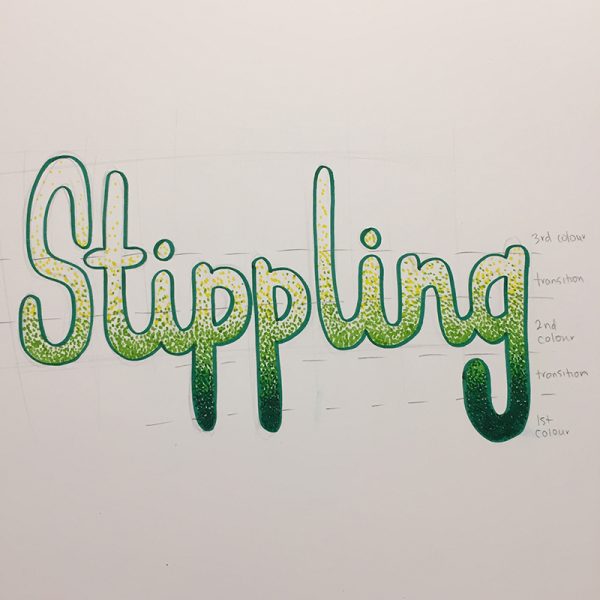
STEP 4: Repeat exactly what you did in Step 3, but with the lightest colour. Once again, integrate the 2nd and 3rd colour through the transition space, and continue the lightest colour up to the top of the word gradually lessening the amount of dots as you approach the top.

STEP 5: Erase all of your guidelines and you have finished blending your colours using a stippling technique!
Thank you, Elizabeth, for breaking down this hand lettering technique for us! Can’t wait to try it…maybe with faux calligraphy too!
To see more of Elizabeth Wise’s art work and be inspired, visit her Instagram @wiselettering and website http://www.wiselettering.com.
Click the images below to shop the tools in http://www.kellycreatesstore.com.