
Producing a beautiful piece of lettering art is always so rewarding, but showing it off in an eye-catching photo is just as important. For those of you who want to share pics of your calligraphy online, Bonnie has lots of awesome tips for you! 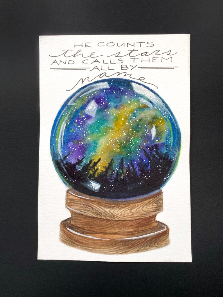 To begin, let me say that I use an iPhone for my photography, but the same styling ideas can be applied to shooting with a DSLR.
I use the Snapseed App for editing my photos. Mostly, the healing tool, if I need to remove a dust spot, the white balance tool for too yellow, or too blue a cast, and the selective tool to brighten dark areas, or darken light areas. There are many apps and tutorials available to help with that process.
The tips I’m about to share here are for showcasing a finished piece of art in one photo.


What we are trying to do is to tell a story, or at the very least, create visual interest with the piece, and possibly cause the viewer to hang out for a couple more seconds.

Use things that go together naturally, that compliment each other, have a cohesive look, or capture a feeling.

Include some of the tools you used, or elements of colour that compliment the piece.
Natural elements add a nice feel. Think plants, a stick, a feather, a leaf.


Shoot from above, ‘Birds eye view.’ Get higher: if need be, stand on a chair.
Shoot square or if in portrait mode, consider how it will appear when squared for aesthetics sake when viewed on other platforms.


Make sure all the important elements are in your shot. You can always crop in tighter afterwards if you prefer, but you can’t expand.


Use a background that compliments what you’re trying to feature. This could be a table top, floor, rug, bed sheets, foam core boards, wrapping paper or the ground.

Whenever possible use indirect natural lighting. Place yourself by a large window or glass doors.
Use white foam core boards to help reflect light on any shadows that are harsh from props or sunlight filtering in.
When placing your items which you’re trying to feature, consider these tips:
- Leave some space for the eye to rest, not too cluttered but interesting and balanced.
- Create some texture if possible.
- Layer a few items.
- Move things around.
- Experiment, be creative, don’t settle on your first arrangement.
- Create a prop box of extras. Some examples are stationary items, faux flowers, art supplies, trinkets.
- Take your photo, but then view it and see where your eye is drawn. Sometimes we aren’t seeing the compositon as we think we are.
- Add hands into the shot, someone else’s or yours if you have a tripod and timer.
- Be aware that the placement of extra props might distract viewers instead of bring them to the focal point, which is your art.
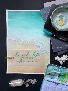
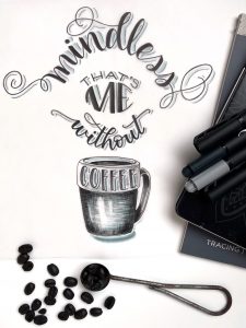
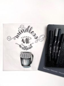
In the photos I have shared here, I am demonstrating all of the above points with props, cropping, colour, texture, and backgrounds, which can make a big difference as to how you are telling your ‘story.’
One or the other is neither right nor wrong, just different. You may choose to have simpler styled photos and one colour scheme. The next person, may like more variety. My aim is to hopefully give you a starting place for creating interesting photographs of your work.
************************************
Bonnie’s photos of her lettering and art are always STUNNING! Click HERE to visit her Instagram account @diamondandwillow, and click HERE to check out her Facebook page Diamond and Willow Artworks.
PIN ME!

Linda Epstein
January 13, 2020 at 7:04 pm (6 years ago)Great ideas. Thank you, Bonnie.